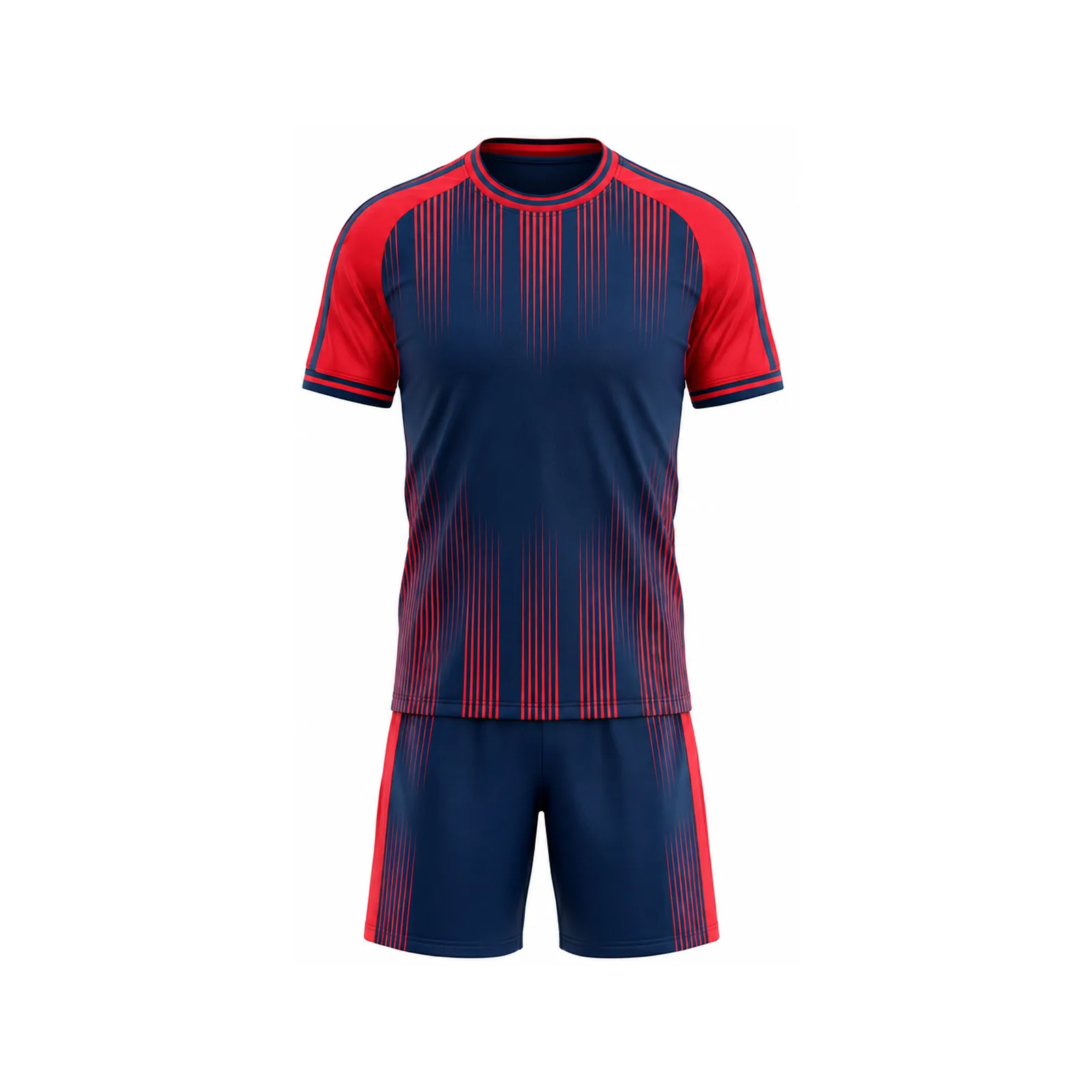
SPENIX WORLD CUP DESIGN REPORT
SPENIX WORLD CUP DESIGN REPORT
Independent 2026 Design Report
World Cup 2026 jerseys turned global football into a live design laboratory. Here are 15 ideas club, school and academy teams can translate into original custom kits—without copying an official uniform.
Editorial note: This is an independent design analysis for custom-team buyers. Spenix is not affiliated with FIFA, the FIFA World Cup, any national federation or any official kit supplier. Team and tournament marks belong to their respective owners.
Why 2026 changed the soccer jersey conversation
The 2026 tournament created an unusually broad design moment. FIFA describes it as the first men’s World Cup with 48 teams and three host countries—the United States, Canada and Mexico. More teams, cities and supporter cultures meant more visual identities competing for attention across broadcasts, phones, stadiums and merchandise. The official FIFA tournament-format overview explains the expanded structure, while the official host-city directory shows the tournament’s geographic scale.
For local teams, the lesson is not to imitate a country’s shirt. The useful lesson is how a kit can communicate identity quickly. A player may be seen from the opposite stand, a vertical phone screen, a team photo or a close product shot. Strong design has to survive every one of those views.
This guide turns the biggest soccer jersey design trends of 2026 into practical decisions for clubs, schools, academies, adult leagues and tournament teams. If you are already preparing an order, pair this trend report with our complete custom soccer jerseys buying guide.
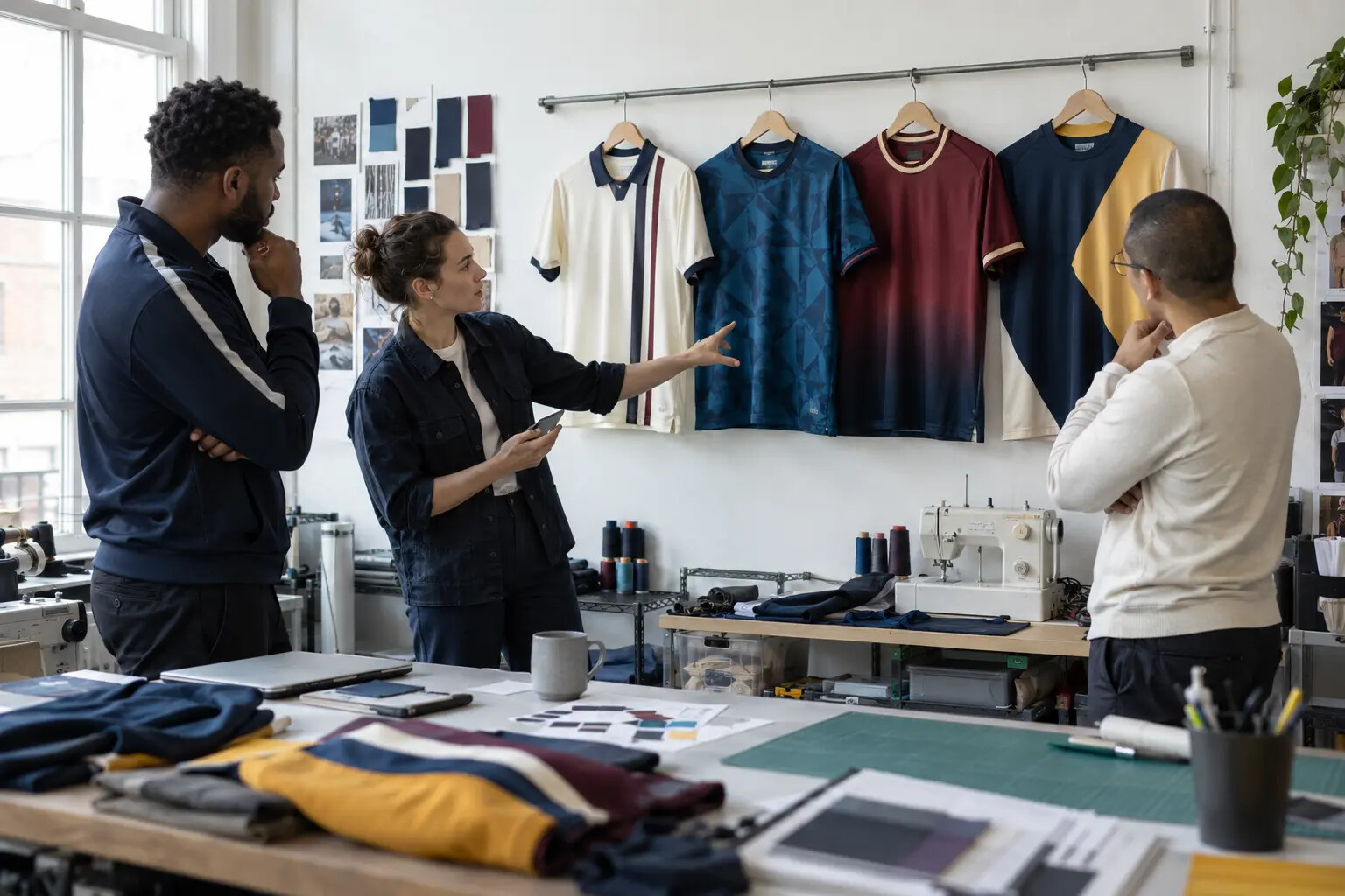
The best trend is the one your team can turn into a clear, repeatable identity.
The design filter: identity first, trend second
Before choosing a collar, pattern or gradient, define three things your uniform must communicate: the team’s primary color, its most recognizable symbol and the feeling the program wants to project. That feeling might be disciplined, aggressive, historic, youthful, technical or community-focused.
A trend should strengthen one of those ideas. If it does not, it is decoration without a job. The most successful custom kits usually have one dominant design move, one supporting detail and a quiet area where the player number can breathe.
The three-question test
Would someone recognize the team if the crest were covered?
Can the number be read immediately while the player is moving?
Will the design still feel intentional after the trend cycle ends?
15 World Cup–inspired jersey trends custom teams can use
1. Heritage collars with modern construction
Fold-over collars, shallow V-necks and contrast collar inserts bring instant football history. The modern version keeps the visual memory but uses lightweight rib, clean binding and a fit that does not become heavy with sweat. One heritage cue is usually enough; adding an old collar, retro shadow numbers, sleeve hoops and a historic crest treatment at the same time can make the kit feel like a costume.
For a club with a long history, use a collar shape or narrow stripe from a past uniform, then rebuild everything else around current fabric and fit. The result feels familiar without becoming a replica.
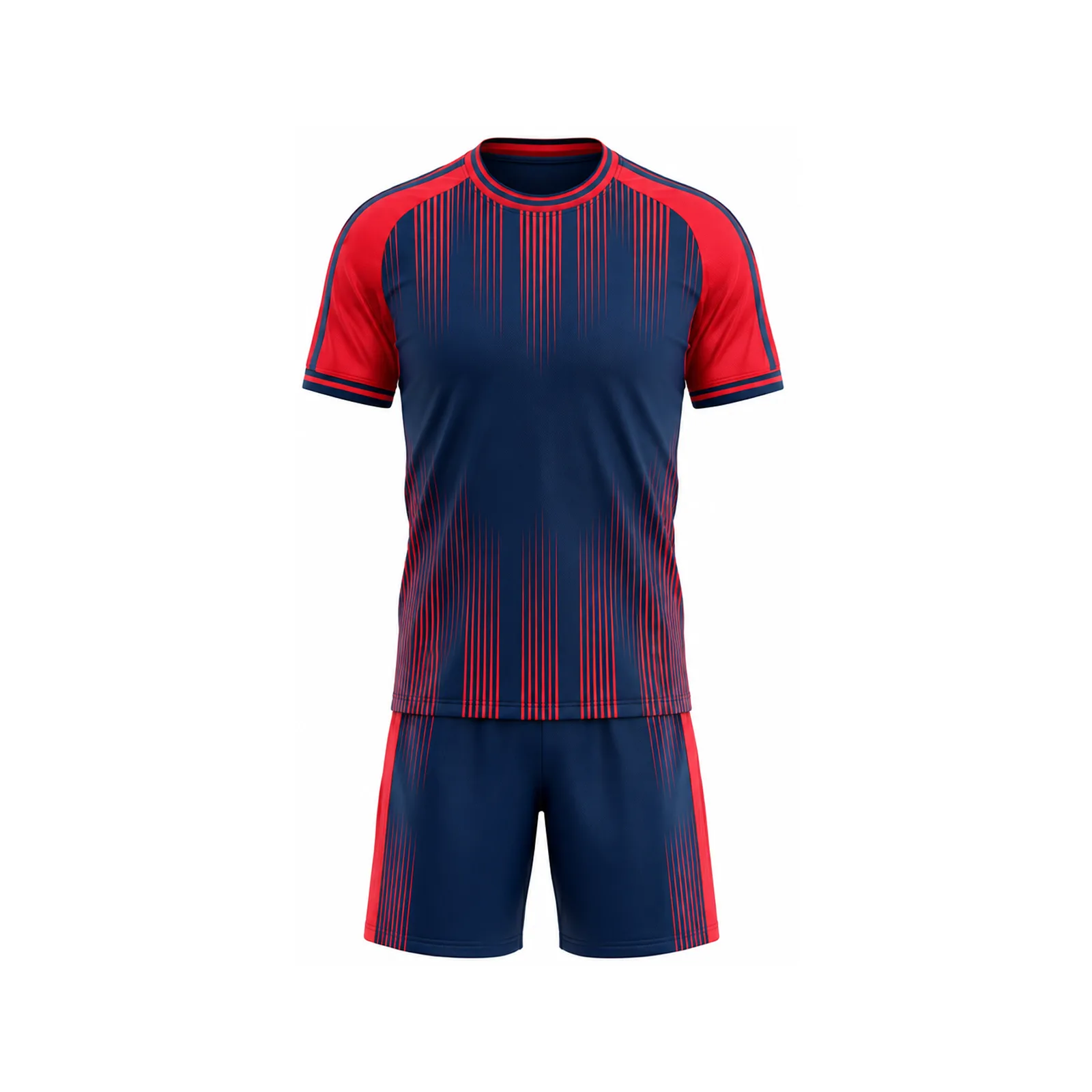
Borrow one piece of history, then give it a modern performance purpose.
2. Large, confident color blocks
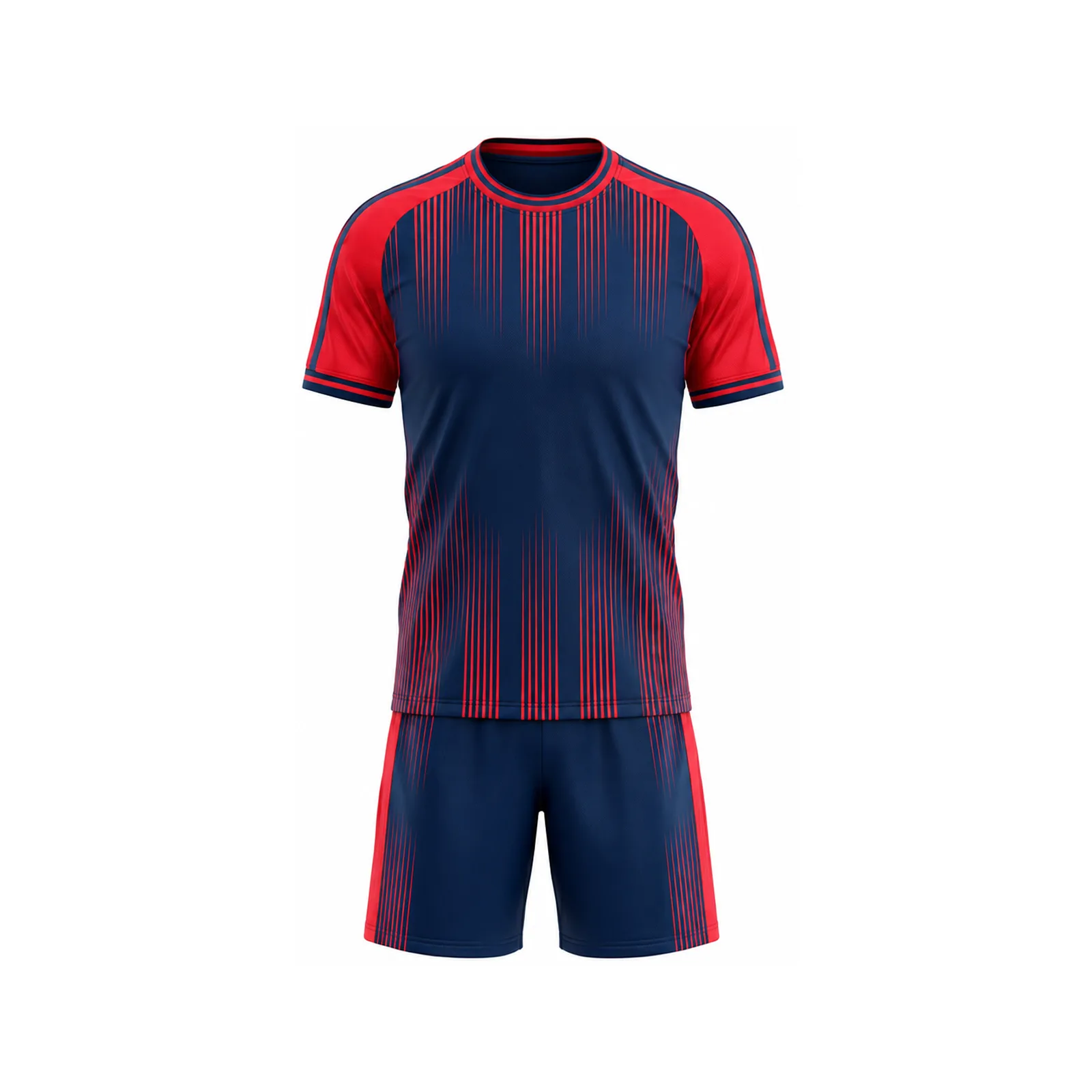
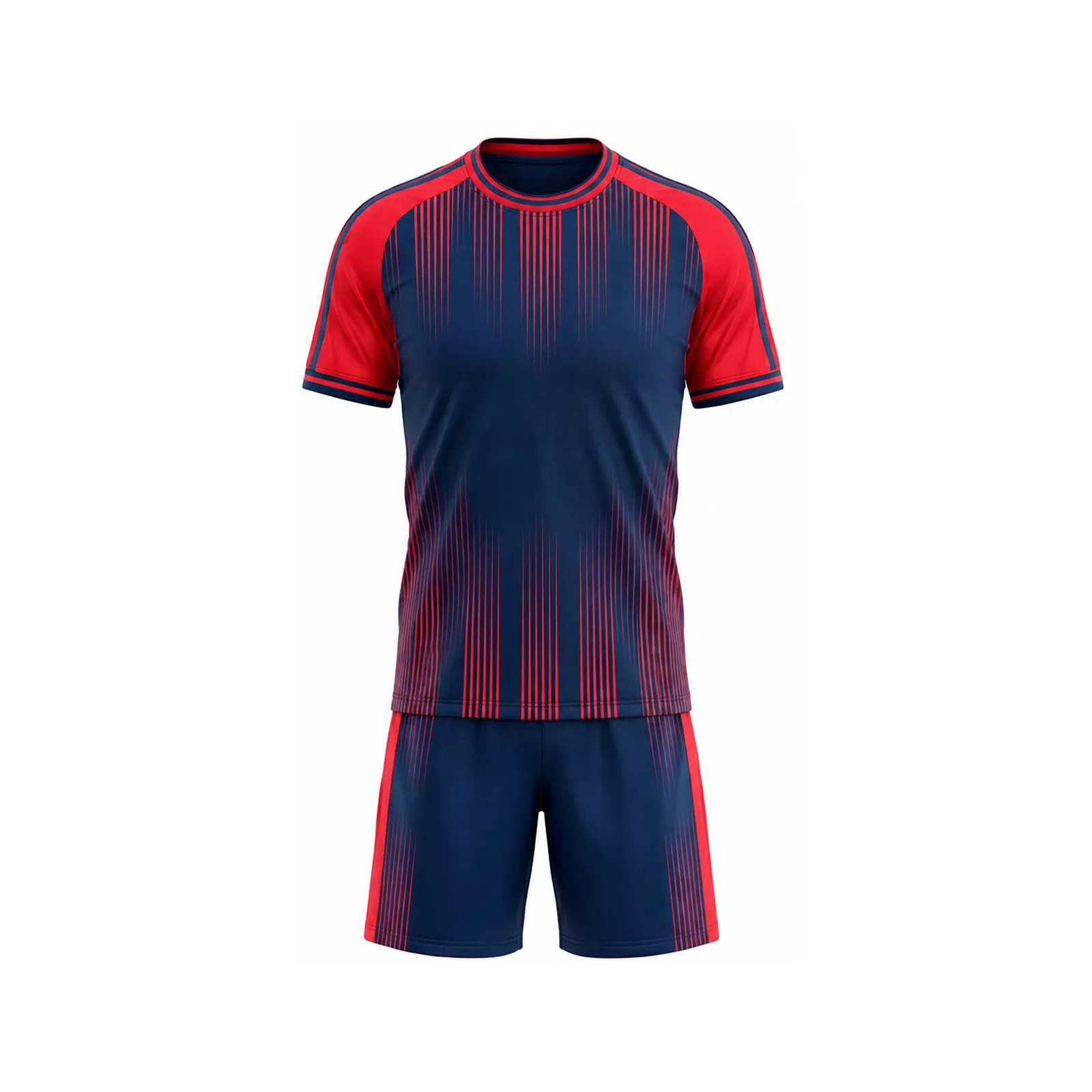
Broad diagonal, vertical or asymmetric fields of color survive motion better than clusters of small graphics. They also create a silhouette that remains recognizable in a wide camera shot. This is especially useful for teams whose crest is too detailed to act as the only identity signal.
Choose one dominant color, one support color and one accent. Let the dominant color own most of the jersey. The support color should organize the panels, while the accent should appear in controlled locations such as the collar, cuff or side seam.
3. Tonal geometric patterns
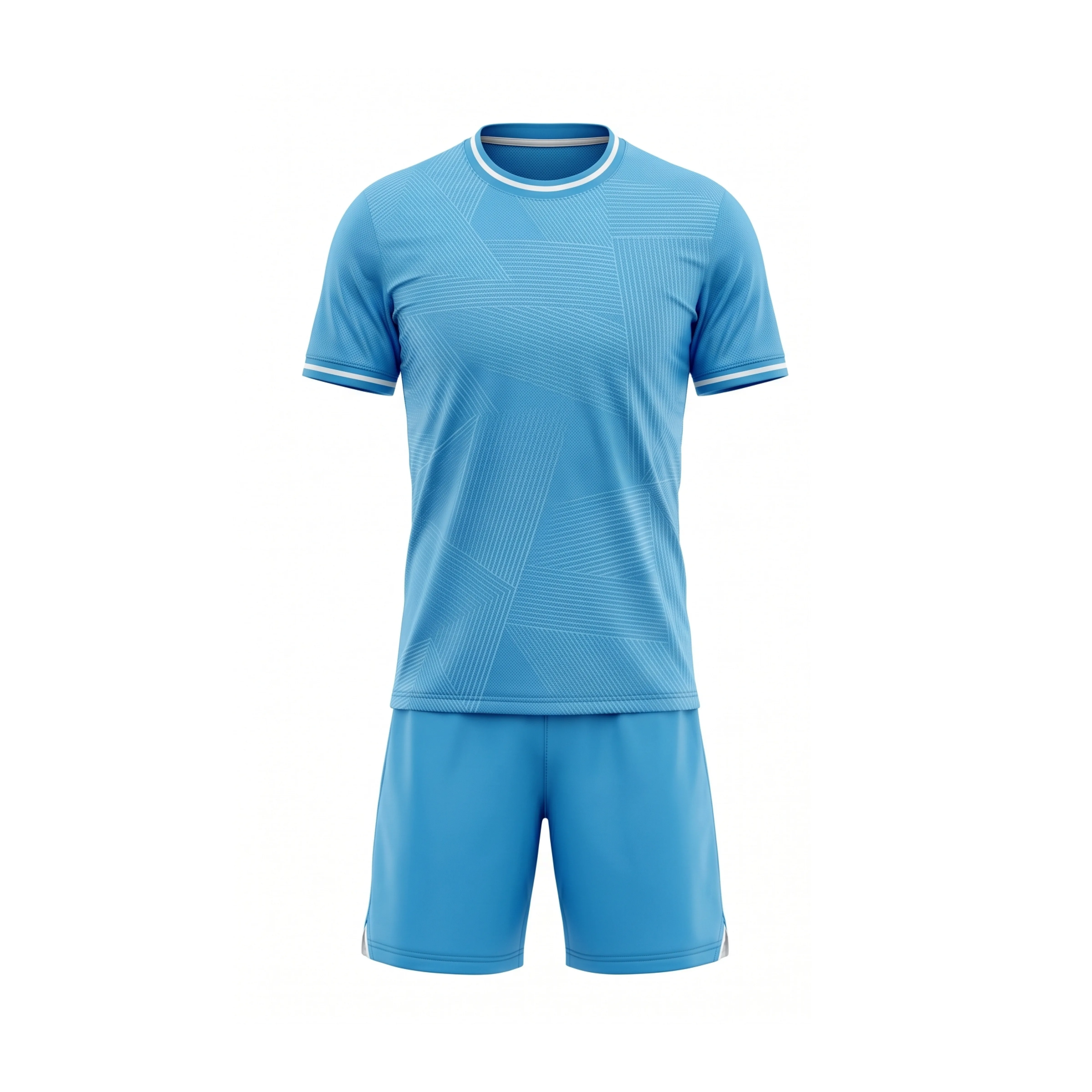
Instead of printing a high-contrast pattern across the entire shirt, many contemporary designs use a tonal pattern that appears up close and becomes a single color from distance. It creates depth for product photography without weakening the match view.
The pattern can come from a local street grid, school architecture, landscape contour or simplified team symbol. Keep it original. Avoid importing a famous national-team pattern and merely changing the color.
4. Controlled gradients
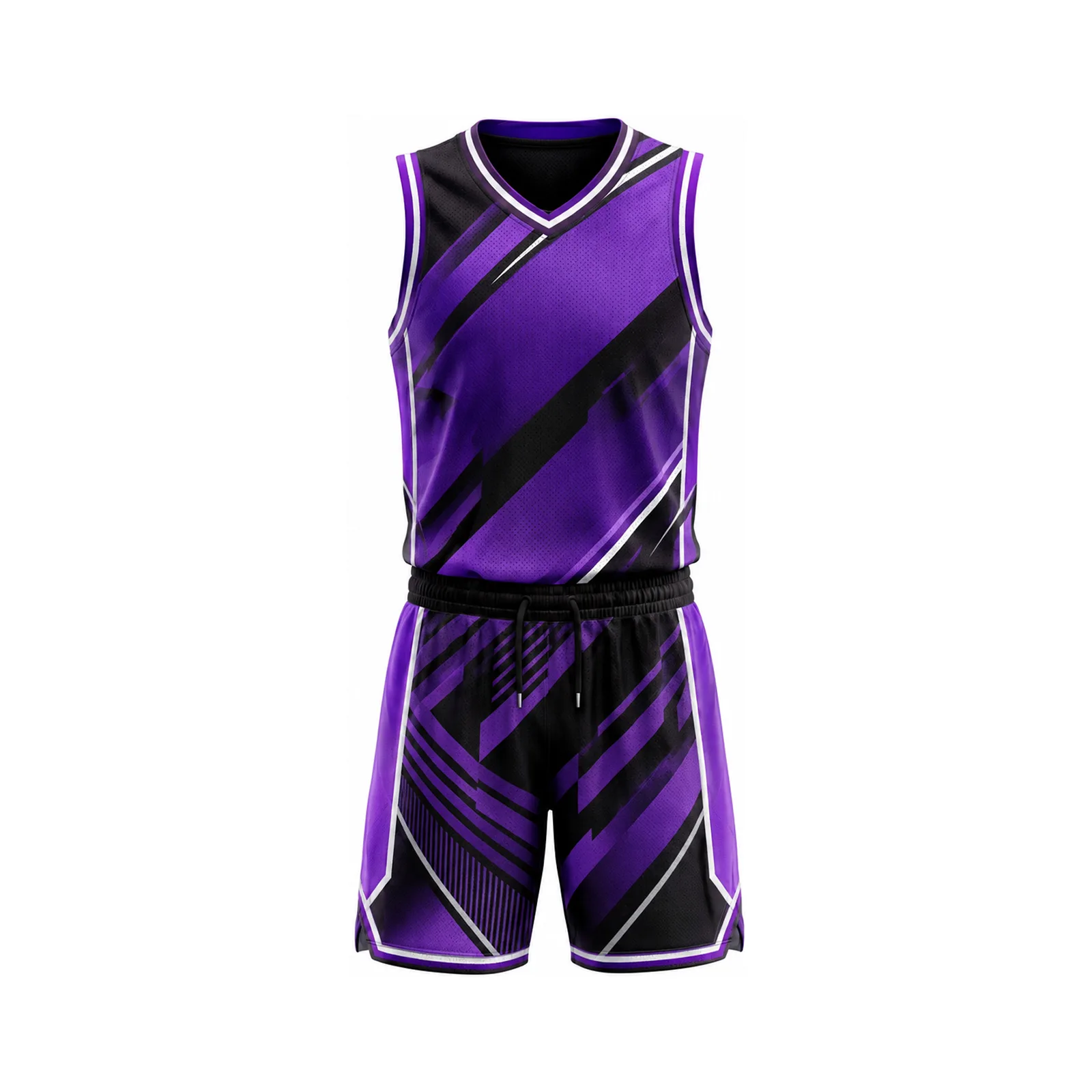
A gradient can add movement, but it should move with the body. Vertical or diagonal transitions tend to create more direction than a random center fade. Keep the number zone stable and test the artwork in grayscale. If the number disappears without color, the contrast is not strong enough.
For production, ask how the gradient will align across front, back and side panels. A digital mockup can hide discontinuity that becomes obvious after cutting and sewing.
5. Local storytelling without literal illustration
A city, school or community reference can make a jersey meaningful, but the strongest versions simplify the story. A river can become one flowing line. A bridge can become a panel angle. A local flower can become a low-contrast texture. Literal skylines and crowded landmark collages often date quickly and compete with sponsors and numbers.
Write the story in one sentence before designing it. If the graphic needs a paragraph to explain, it is probably too complicated for a game jersey.
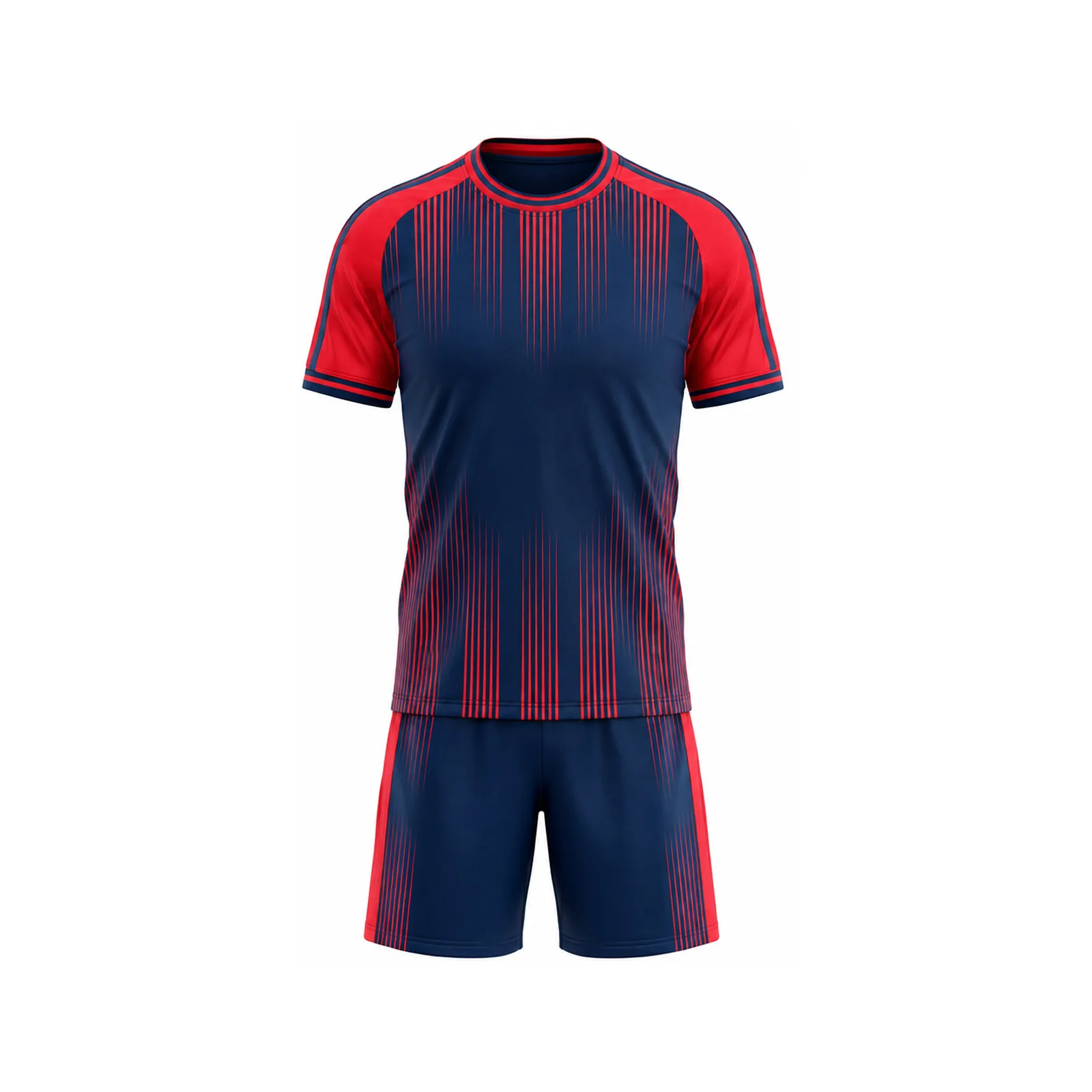
Bold blocks and clean numbers keep the team readable at full speed.
6. Numbers designed as part of the kit
The player number is not an afterthought. Its width, outline, spacing and color should be tested against the busiest part of the design. A narrow fashion font may look elegant on a presentation board and become unreadable from the opposite touchline.
Create a front number, back number and shorts number as one family. Test single digits, wide double digits such as 88, and narrow combinations such as 11. The type system should work for every roster number, not only the sample shown in the first mockup.
7. Custom typography with restraint
Teams are increasingly using custom letterforms to create distinction. The safest approach is a practical number font with one or two unique cuts, not an alphabet full of visual tricks. Player names need enough spacing to remain legible after printing and across different name lengths.
Ask for the longest player name to be tested before approval. A layout built only around a short sample name can fail when the real roster arrives.
8. One visual system for home, away and goalkeeper
Modern team branding is strongest when all three kits share a structure. The home jersey can carry the primary color, the away version can reverse the balance, and the goalkeeper can use a clearly contrasting tone while keeping the same collar, number style or side-panel logic.
This does not mean the kits must look identical. It means they should look related. A consistent system also helps social media, team photos, reorders and future merchandise.
Different match roles, one recognizable club identity.
9. Sleeve and side-panel storytelling
The center of the jersey has many jobs: crest, number, sponsor and primary identity. Sleeves and side panels give secondary graphics a safer home. A pattern can become more expressive there without disturbing the number zone.
Remember that side panels curve around the body and sleeves rotate during movement. Review an on-body sample or realistic proof rather than trusting a perfectly flat template.
10. Micro-texture built for close photography
Modern jerseys are viewed at two speeds: far away in the match and very close in content. A tonal weave effect, subtle pattern or small inner-collar detail rewards the close view without creating noise from distance.
Use micro-details where they can be produced cleanly. Tiny lines that fall below the printer’s reliable detail level may blur or merge. Ask for a printed sample if the texture is central to the concept.
11. Fit systems designed for the actual roster
A 2026 kit should not be designed around one body type. Youth, women’s, adult unisex and goalkeeper cuts can share the same identity while using different patterns and grading. Place the crest, sponsor and number so they remain balanced across the full size range.
Run a physical size-set fitting when possible. Our soccer jersey sizing and ordering guide explains how to build a safer roster sheet.
12. Performance zones that look intentional
Mesh, perforation and stretch panels can support ventilation and movement, but they also change color and print appearance. Rather than hiding these areas, make them part of the panel plan. A darker mesh underarm or tonal shoulder zone can look deliberate while serving a construction purpose.
Compare fabric weight, opacity, stretch and moisture behavior—not only fiber content. Broader performance-wear developments are covered in our activewear trends report.
13. Sponsor-ready quiet zones
Teams often approve a dramatic pattern before confirming sponsor placement. The result is a logo trapped inside visual noise. Build one or two quiet zones from the beginning so sponsors remain legible without placing a large box over the finished design.
Competition rules vary. The IFAB Law 4 equipment guidance addresses colors, slogans, statements, images and advertising. College programs should also check the current NCAA soccer playing-rules resources. Always confirm the rules for your own competition.
14. Collectible details with a real purpose
Limited-edition thinking influenced 2026 football merchandise: special inner labels, numbered runs, presentation packaging and digital experiences. A local club does not need expensive technology to borrow the useful principle. A season date, founding year, player message or small authenticity detail can make the kit feel worth keeping.
Keep these elements secondary. They should reward ownership, not interfere with match readability or imply an official tournament connection.
15. Reorder-proof design systems
The least glamorous trend may be the most valuable: organized design files. Teams need replacements, new-player kits and future-season updates. Store the final artwork, color references, fabric specification, approved number font, roster template and production notes together.
A good tech pack protects that system. See our guide on how to prepare a sportswear tech pack before production begins.
Trend-to-team translation matrix
Use this table to choose a trend for a reason rather than selecting it because it appears fashionable.
Team goalUseful design directionMain riskApproval test Honor historyHeritage collar or one classic stripeCostume-like overloadRemove one retro element; is the story still clear? Look modernLarge color blocks or controlled gradientShort-lived visual effectView the concept without the trend label Show local identityTonal pattern or simplified landmark geometryLiteral collageCan the story be explained in one sentence? Improve recognitionConsistent kit family and readable numbersToo many unrelated versionsCompare home, away and keeper at thumbnail size Support sponsorsPlanned quiet zonesLogo box added after designTest every sponsor mark on the final pattern
From trend board to production: a seven-step workflow
A strong mood board is only the beginning. The following workflow keeps visual inspiration connected to the roster, budget and delivery date.
Step 1: write a one-sentence identity brief
Describe what the team should feel like before naming any trend. For example: “A disciplined city club with a bold night-game identity.” That sentence becomes a filter. Heritage details, colors and patterns must support it or be removed.
Step 2: separate inspiration from protected identity
Collect examples because of a principle—collar shape, color balance, number contrast or panel direction. Do not build the brief around another team’s crest, exact pattern, federation mark or recognizable kit arrangement. Originality is easier when every reference has a written reason.
Step 3: lock practical requirements
Confirm quantities, size ranges, women’s or youth cuts, goalkeeper needs, sponsor positions, competition rules, target budget and required delivery date. These facts determine which design ideas are realistic. A concept that cannot support the roster is not ready for production.
Step 4: approve the kit family, not one shirt
Review the home jersey, away jersey, goalkeeper jersey, shorts and socks together. Add front and back views. A consistent presentation exposes color clashes and helps the team decide which elements should repeat.
Step 5: run distance and motion tests
Shrink the artwork to phone-thumbnail size, print it, place it across the room and convert it to grayscale. If possible, apply the concept to a realistic on-body proof. Focus on the numbers, crest, sponsor and dominant silhouette.
Step 6: approve one controlled final file
Avoid scattered approvals across different chats. Use one final proof, one roster and one dated sign-off. Confirm spelling, number duplication, size, color reference and every placement. Any later change should create a new clearly labeled version.
Step 7: preserve the reorder system
After delivery, store the production artwork and garment specification with the final roster. Ask how small reorders work and whether the same fabric will remain available. This turns a one-season trend into a manageable club identity.
Avoid the trend trap
Do not combine every popular idea in one uniform. A heritage collar, full-body gradient, map pattern, shadow number, oversized sponsor and multiple textures will compete. Choose one hero move, one supporting detail and one quiet zone.
A final practical rule: design for the least glamorous moment. Imagine the kit after repeated washes, under uneven field lighting, partly covered by a training vest and photographed on an older phone. If the team color, number and overall identity still read clearly, the design has a strong foundation. Premium presentation matters, but dependable recognition is what carries the uniform through an actual season.
Match the trend to the production method
Design ideaOften suited toWhat to sample Gradient or tonal patternSublimation on suitable polyesterColor transition and panel alignment Raised premium crestEmbroidery or an approved badge systemWeight, stiffness and edge finish Late-added player nameCompatible heat-applied decorationBonding, stretch and care method Performance mesh zoneCut-and-sew panel constructionColor match, opacity and seam comfort
What deserves the most attention before approval?
The chart below is an editorial design-review framework—not search-volume data or a scientific score. It shows where teams should spend their approval energy because mistakes in those areas are hardest to live with during a season.
Recommended design-review priority
Number readability100
Fit across roster95
Color and kit-family consistency90
Fabric and construction88
Trend-specific effects60
Sublimation, embroidery and applied marks
Sublimation gives designers the most freedom for gradients, tonal maps and geometric patterns on suitable polyester fabric. Embroidery gives a raised premium effect for selected crests or details, while heat-applied marks can support later personalization or simpler sponsor changes. The visual concept should respect the production method from the beginning.
Large embroidered areas can add weight. Very fine tonal artwork may not reproduce as expected. Applied decorations need correct bonding and care. Review our detailed guide to sublimation vs. embroidery for teamwear before choosing a finish.
How to brief a designer without copying an official jersey
Reference principles, not protected identity. Instead of saying “copy this country’s shirt,” describe what you actually like: the disciplined collar, the broad diagonal direction, the tonal depth or the limited palette. Then connect that principle to your own team story.
Provide your original crest and approved colors.
Choose one dominant trend and one supporting detail.
Explain the local or team-specific story in one sentence.
Share the roster, fit needs, sponsor requirements and deadline.
Request home, away, goalkeeper, shorts and socks on one presentation board.
Approve the number system and longest player name separately.
Questions teams are searching before ordering
What are the biggest soccer jersey trends in 2026?
Heritage collars, strong color blocks, tonal local patterns, controlled gradients, coordinated kit families and readable custom typography are among the most useful directions. The right choice depends on the team’s identity and production plan.
Can a local team use a World Cup–inspired jersey design?
A team can be inspired by broad design principles, but it should not copy an official kit, crest, federation mark or tournament branding. Translate the idea into original colors, geometry and storytelling.
Which jersey colors look best on camera?
Colors with clear light/dark separation usually survive broadcast and phone screens better. Test the full kit under realistic light, against the field and in grayscale. There is no single best color for every team.
Are gradients good for custom soccer jerseys?
Yes, when they create direction and protect number contrast. Keep the main identification area stable and review how the transition crosses sewn panels.
What makes a soccer jersey look professional?
A limited color system, consistent typography, balanced logo placement, clean construction, correct fit and a coordinated home/away/goalkeeper family usually matter more than adding extra effects.
How many colors should a soccer kit use?
Three roles are often enough: dominant, support and accent. Additional shades can appear in a tonal pattern, but each visible color should have a purpose.
How do you make jersey numbers easy to read?
Use strong value contrast, practical stroke width and enough quiet space around the digits. Test front, back, single and double-digit numbers from distance and in motion.
Should home and away jerseys match?
They should belong to the same identity system, but they do not need to be identical. Shared typography, collar logic, panel lines or accent placement can create the connection.
How early should a team start a custom kit?
Start early enough for roster collection, design revisions, sample review, production, quality control and delivery. The supplier’s production estimate normally begins after final approval, not at the first inquiry.
What should a team send for a custom jersey quote?
Send quantity, deadline, age group, required kit pieces, size range, logo files, colors, personalization needs, sponsor details and competition requirements. Clear information produces a more useful quote.
Final approval checklist
Crest, sponsors and colors match the approved files.
Numbers remain readable at distance and on every kit color.
Home, away and goalkeeper versions look like one club.
The design works across youth, women’s and adult sizes where needed.
The roster, spelling, numbers and sizes have one dated approval.
Reorder files and production notes will remain available.
Before placing the order, review these 11 costly custom soccer uniform ordering mistakes. For cross-sport design inspiration, compare our reports on basketball jersey design trends and football uniform readability.
Use the trend. Keep your identity.
Ready to turn a 2026 design idea into an original team kit?
Send Spenix your colors, roster, deadline and design direction. We’ll help organize the concept into a production-ready custom soccer uniform system.
Request a Custom Quote Explore Soccer Uniforms
Built for teams. Designed to perform.
Your colors. Your roster. Your Spenix system.
Built for teams. Designed to perform.
Your colors. Your roster. Your Spenix system.